

Effect Studios (for Skin Gourmet)
UX/UI design, design system, interaction design
Figma
Skin Gourmet were keen to redesign their website to better cater to their customers worldwide. Their former site was no longer fit for purpose as they found their previous UX and UI outdated and lacking core features. They didn't have a functioning online store, which made it difficult for them to market and sell to customers who were interested in their goods outside of Ghana. On top of that, they felt that the site didn't truly showcase their array of unique skincare products, and wanted a revamped site that would have their products at the center of the site, while also showcasing the brand's story and values.
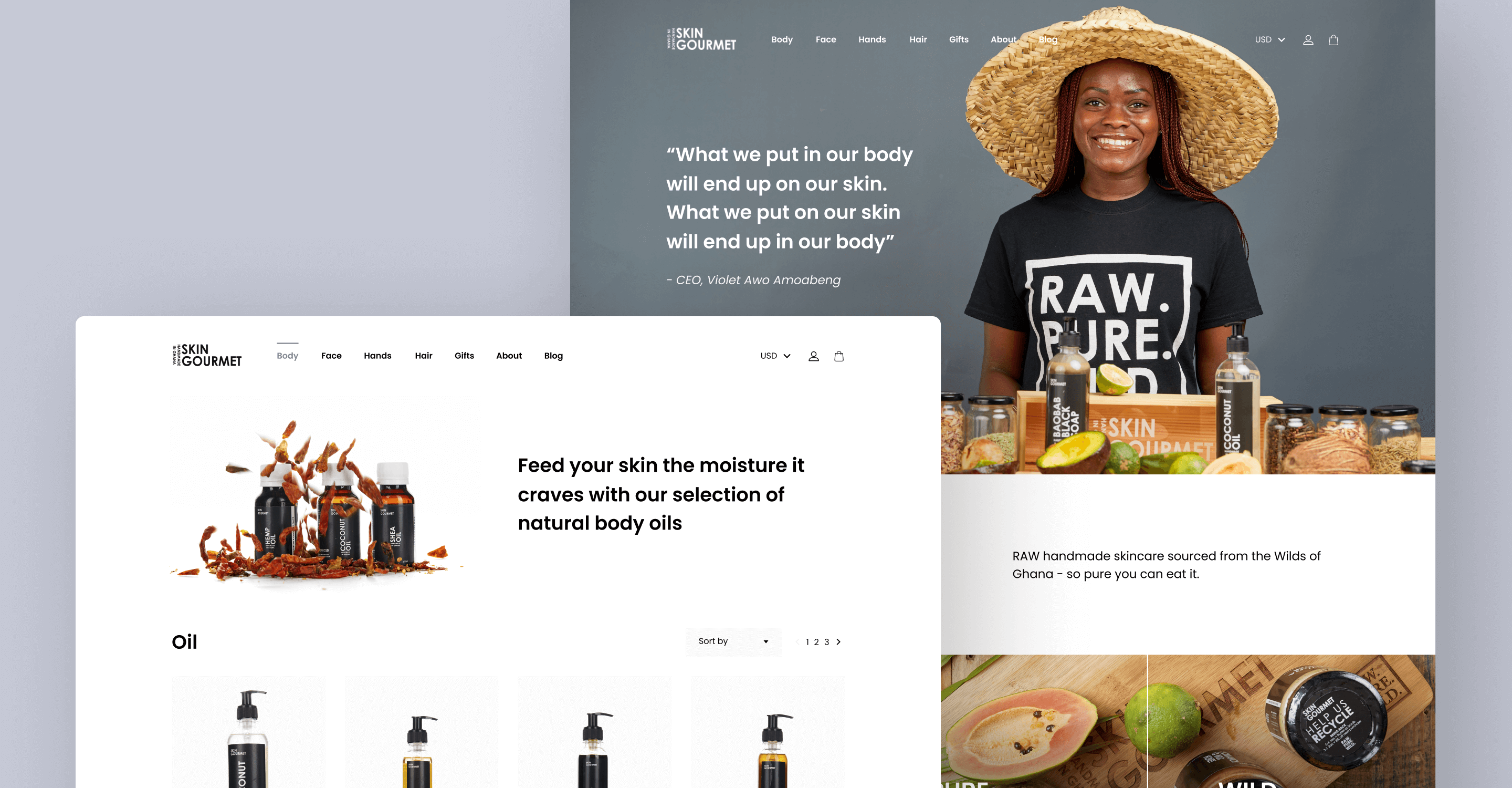
With a clear brief and vision in mind from the client, I designed a modern website which really showcased their bold, colourful imagery and highlighted their suite of skincare products. I also crafted a seamless online shopping experience, making it easy for their customers worldwide to get their hands on Skin Gourmet's products.
Categories are clearly displayed at the top of the store with the use of bold, striking imagery. By grabbing your attention, users are able to use them to quickly filter down to find exactly what they're after.
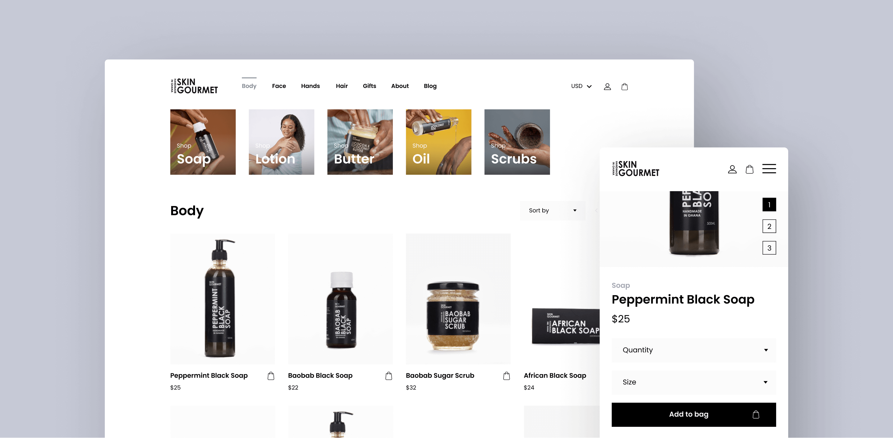
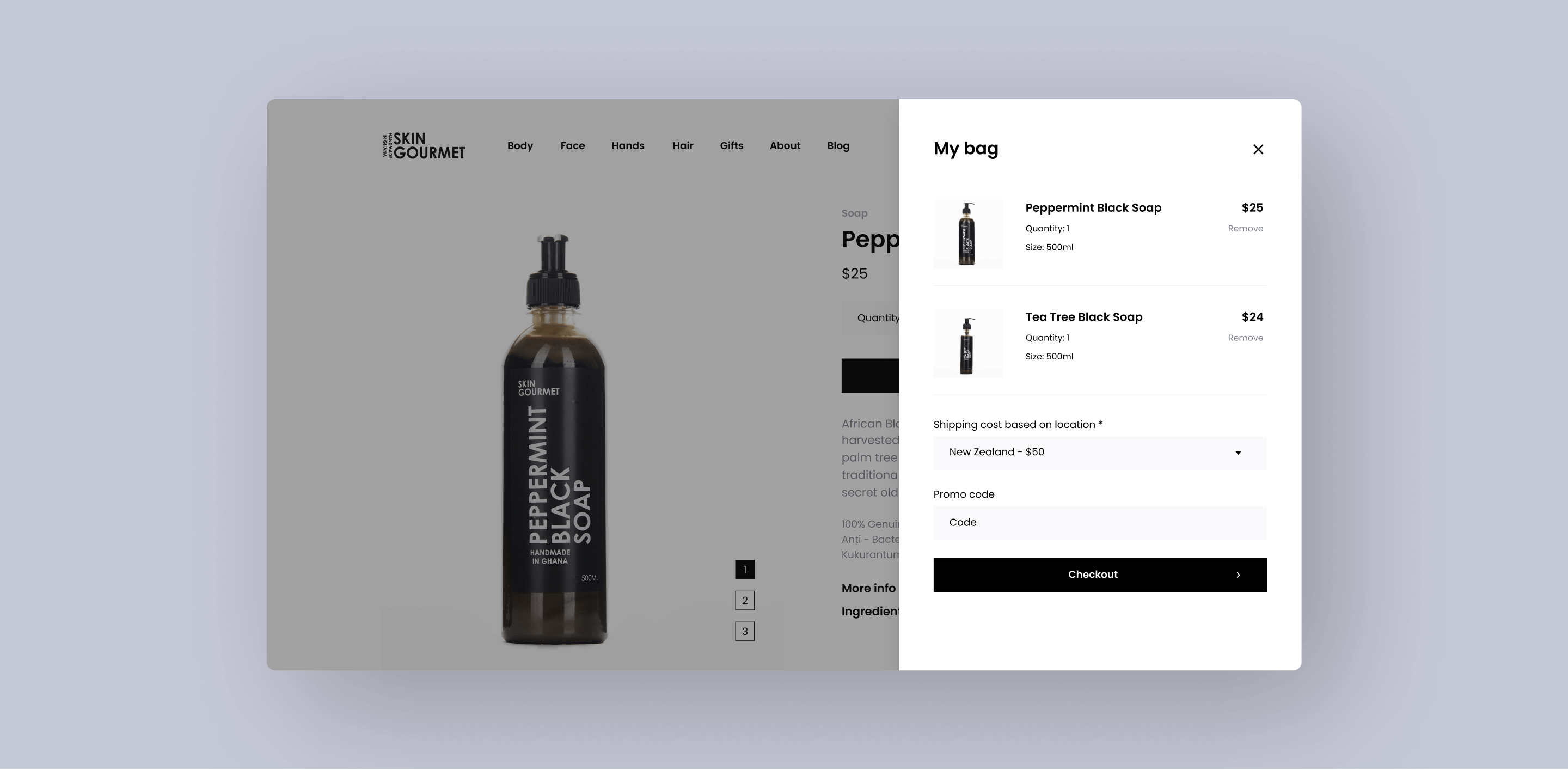
Users are given a clean and simple overview of the product they're interested in. Large, high quality product photos give users an idea of what they're buying, with additional product info and ingredients also being available to read up on. Users can also add products to their bag and get an overview of what they're currently looking to buy.

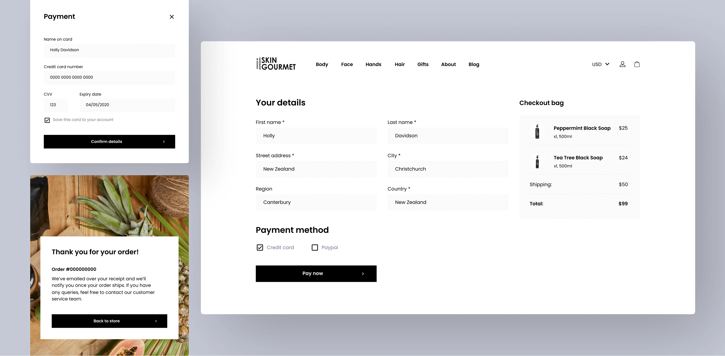
The checkout process on site is seamless, regardless of whether users decide to shop on desktop or mobile. The process is intuitive and allows users to quickly enter in or edit their details before confirming payment.
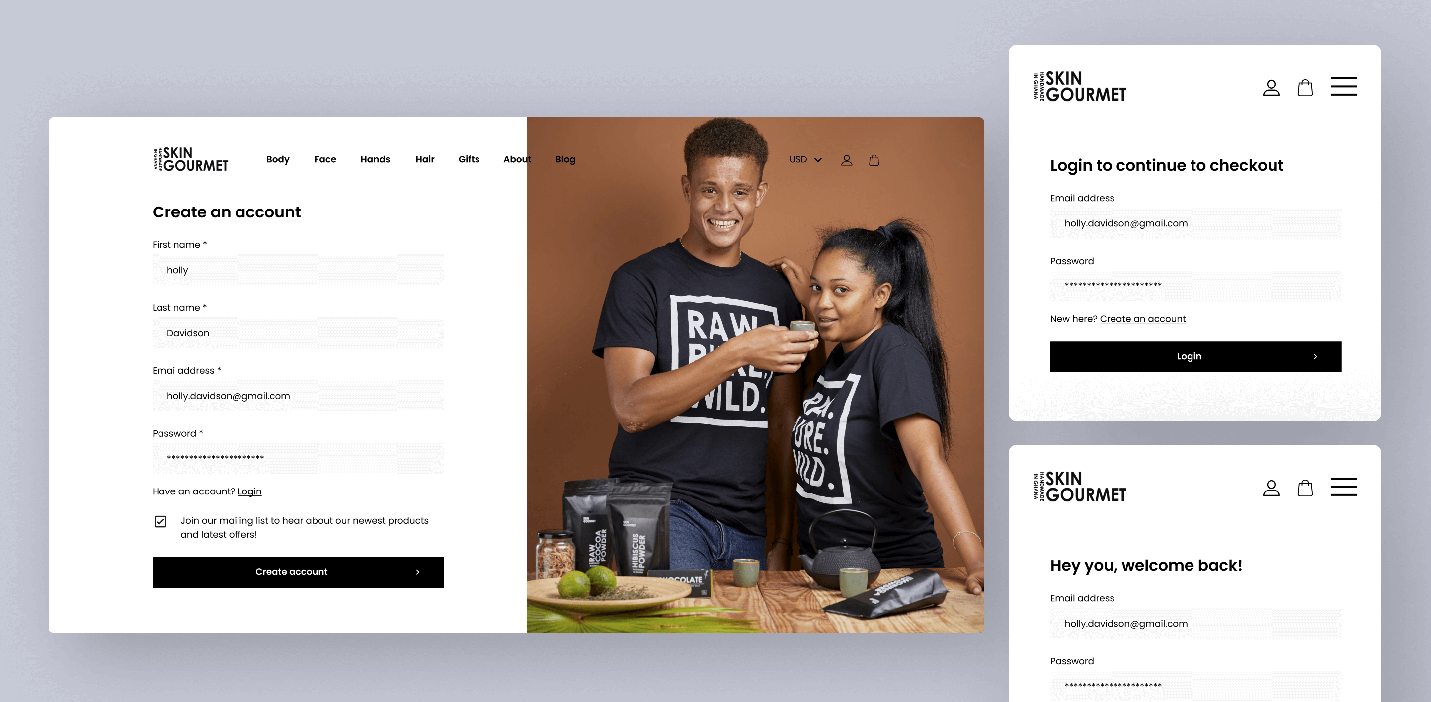
Setting up an account is easy, and allows users to complete their purchases as well as view their purchase history and shipping status. Details are able to be updated with ease, ensuring users are able to keep their account up to date.

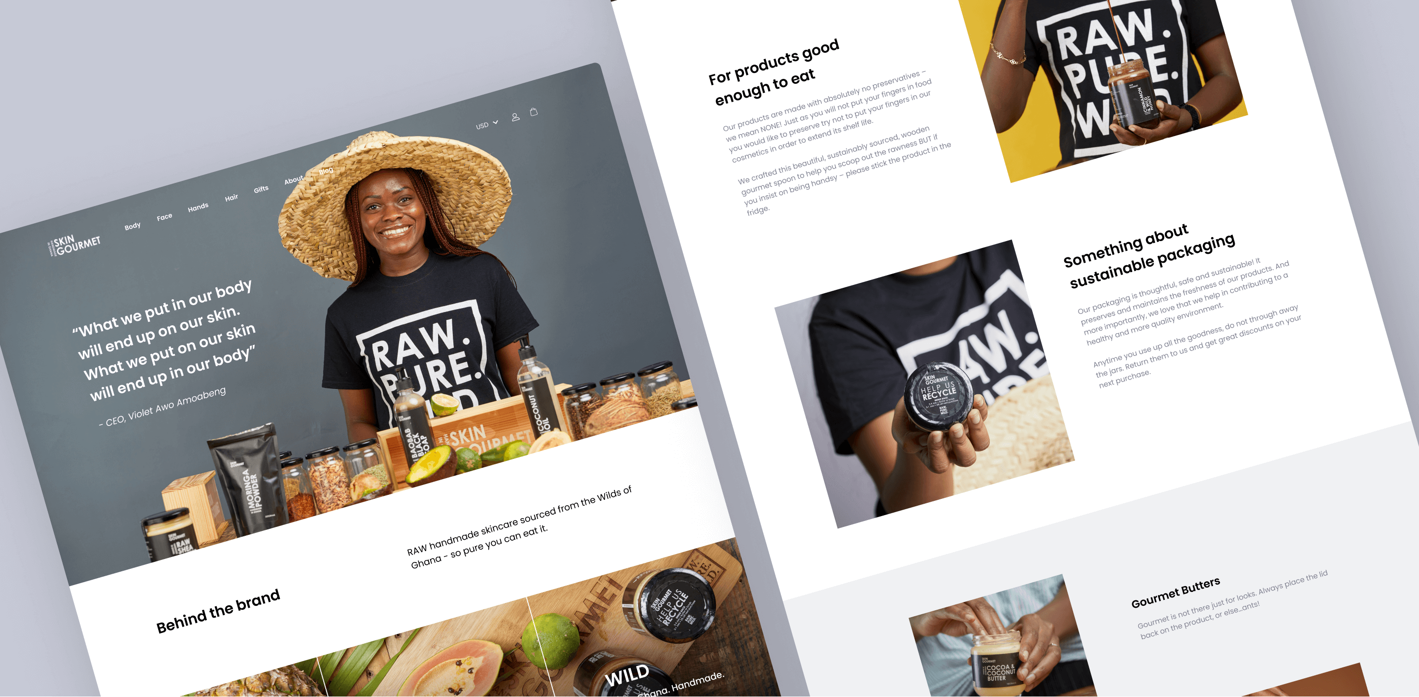
Customers interested in learning more about the brand can read up on the brand's story, vision and values. Imagery is used throughout the page to captivate users as well as showcase the brand's suite of products. Large amounts of white space between content blocks further emphasises the imagery and products.
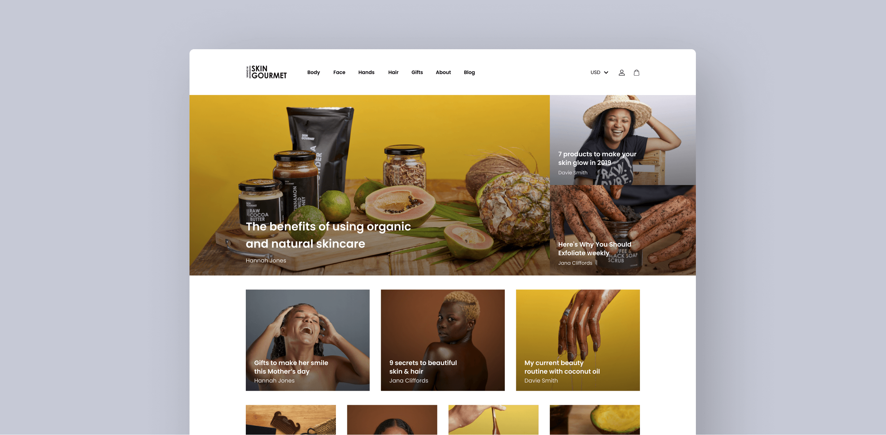
Launching the redesigned site has allowed Skin Gourmet to start expanding and selling their products worldwide, helping connect them to a diverse and large customer base around the globe. The improved UX and UI on-site has also made the site easier to navigate for customers, allowing them to easily find what they're looking without a hassle.