

Got Plans
Brand identity, UX/UI design, design system, interaction design
Illustrator, Figma
Got Plans came to me in their early stages, before they had even finalised any sort of branding. They envisioned creating a platform helping kiwis connect with one another over shared experiences (e.g. through teaching someone a new skill, cooking together, or simply grabbing a drink when you have some down time) as well as helping them connect with local businesses who provide unique activities and adventures. They had a few rough wireframes to illustrate some of the features the platform would have, but needed guidance on how their brand and platform would look, feel and function.
I worked with the team to craft a brand identity that was fun and exciting for users, conveying the brand's objectives and values. This was carried through to the design of the mobile first website, where ease of use, simplicity and user enjoyment were at the core of my design decisions.
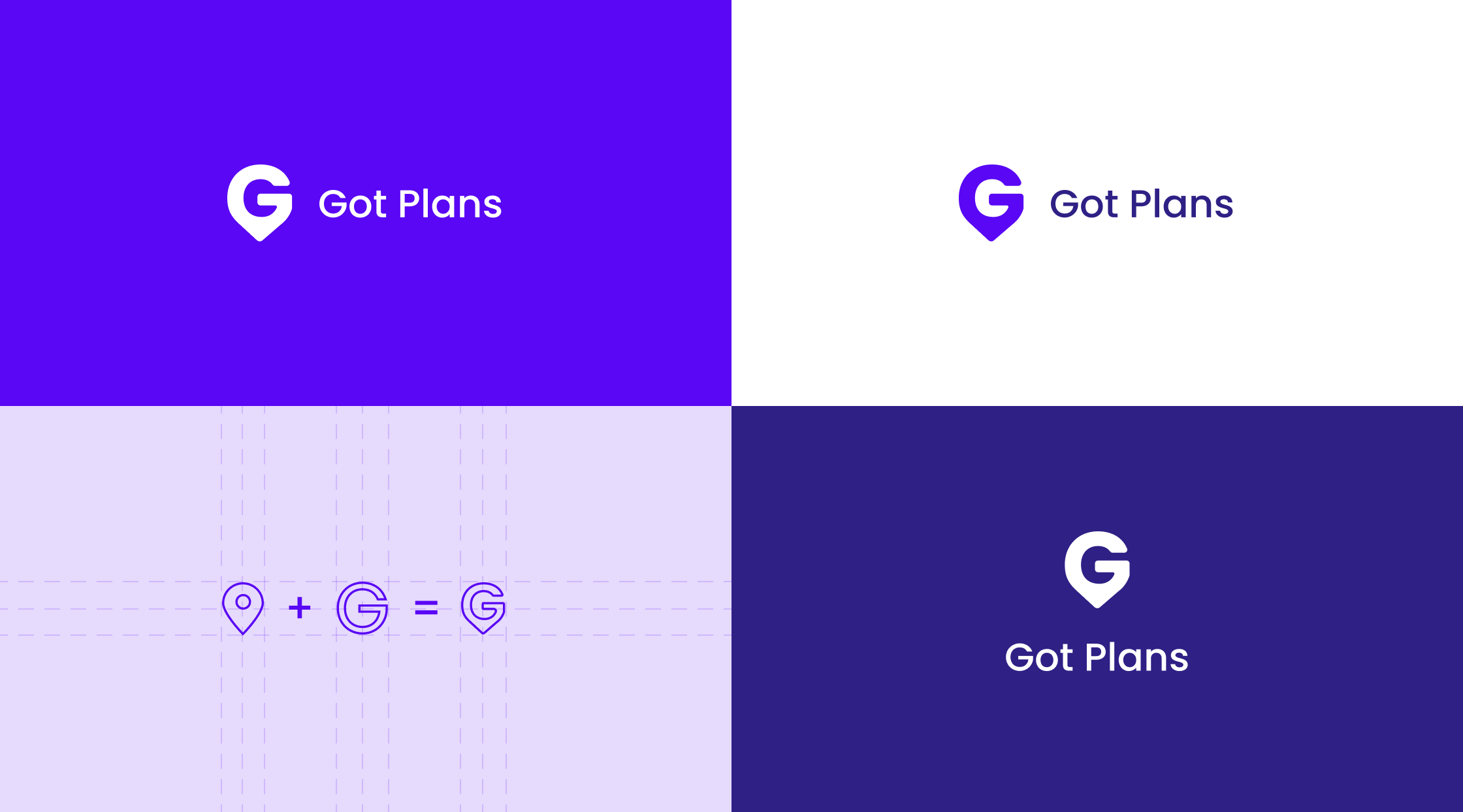
The idea for the logo came from the desire to form a brandmark that captured the brand's sense of fun and adventure, whilst still being easily recognisable and simple. Got Plans had been playing with the idea of using a location pin as their logo and I decided to use this as my starting base. After playing around with a countless number of design ideas, I decided on merging a 'G' with a location pin to create a simple yet creative logo that was unique to the brand.
The colours used also showcase the brands core values and were chosen to appeal to their diverse audience. I chose a vibrant purple shade as our main branding colour to embody the brands boldness, creativity and independence, as well as work well with our bright yellow secondary colour to give the brand a fun and fresh look and feel. Various purple shades were also used to build the brand's colour palette and add layers to the visuals.

Got Plan's feed lets users easily find experiences relevant to them. From search by location helping localise results, to filters allowing you find experiences that interest you, when you're free. Local businesses can also list activities and experiences they offer on the platform, allowing users to find unique paid experiences they might've otherwise missed.


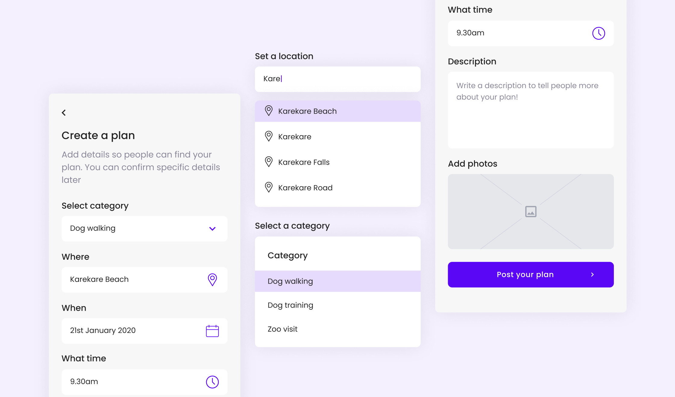
Creating experiences on Got Plans is a quick process with only a few questions needing to be answered to get your plan into the world. Drop downs are used to help speed up the process, and images are able to be added to provide users with a bit more context and information.
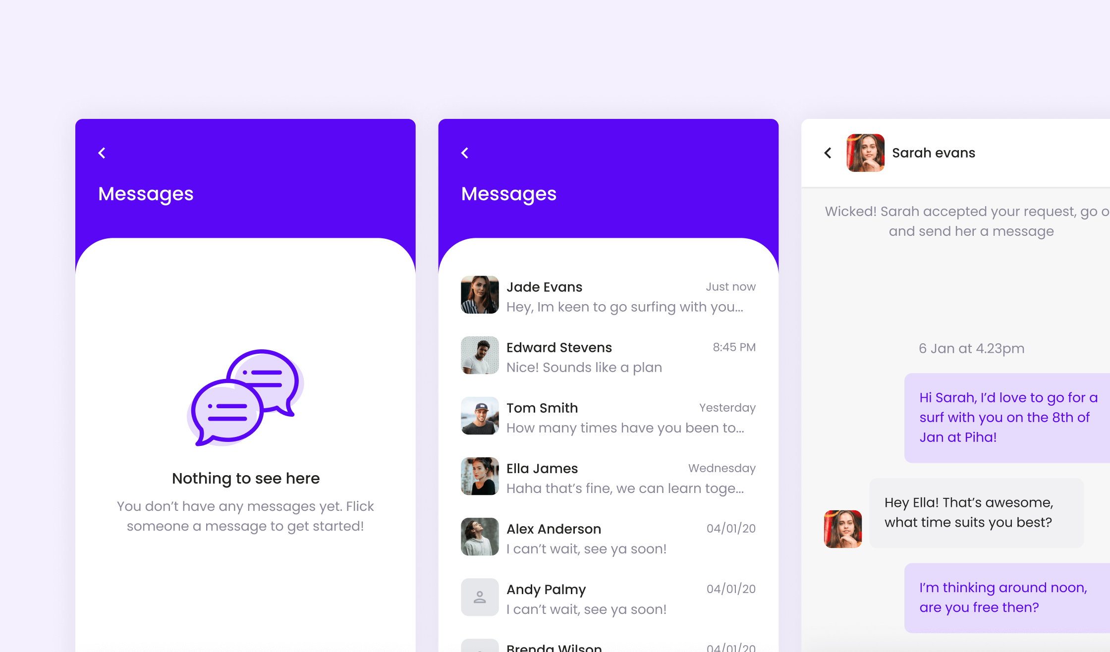
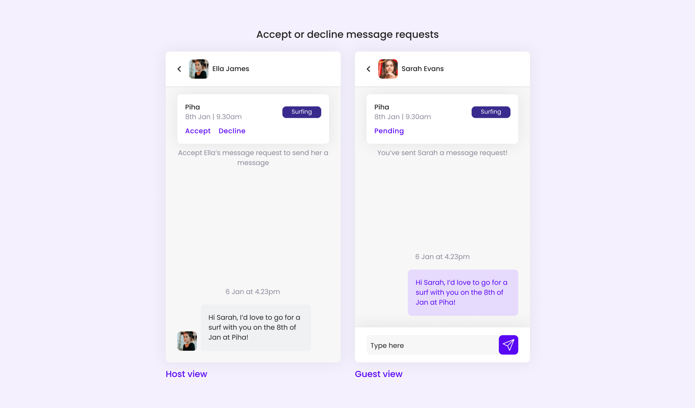
Users interested in an experience can reach out to the host and chat directly on the platform, with hosts having the ability to accept or decline requests from users. Got Plan's messaging platform enables users to plan out the details around the activity without having to leave the platform and communicate over a different service.
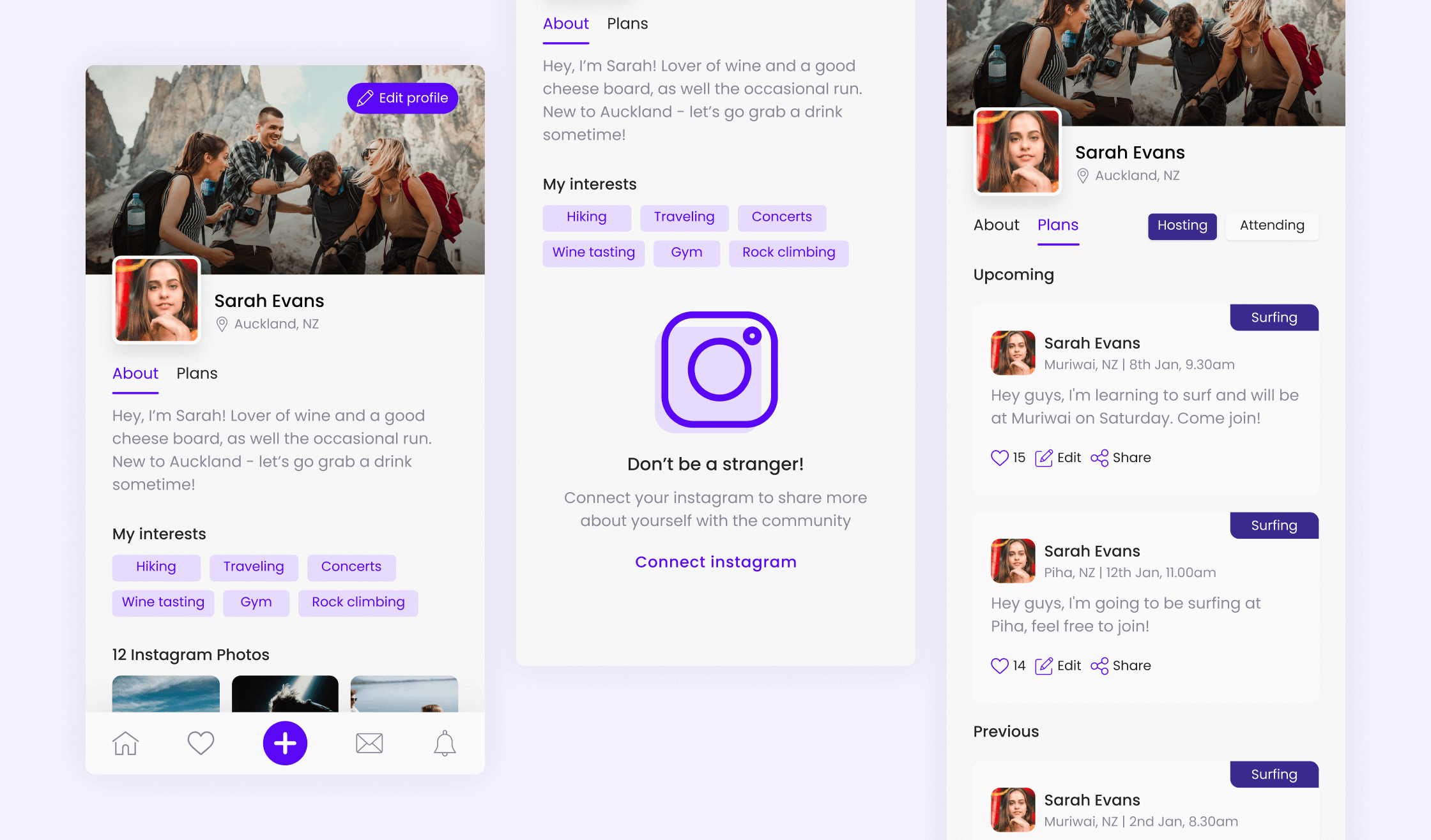
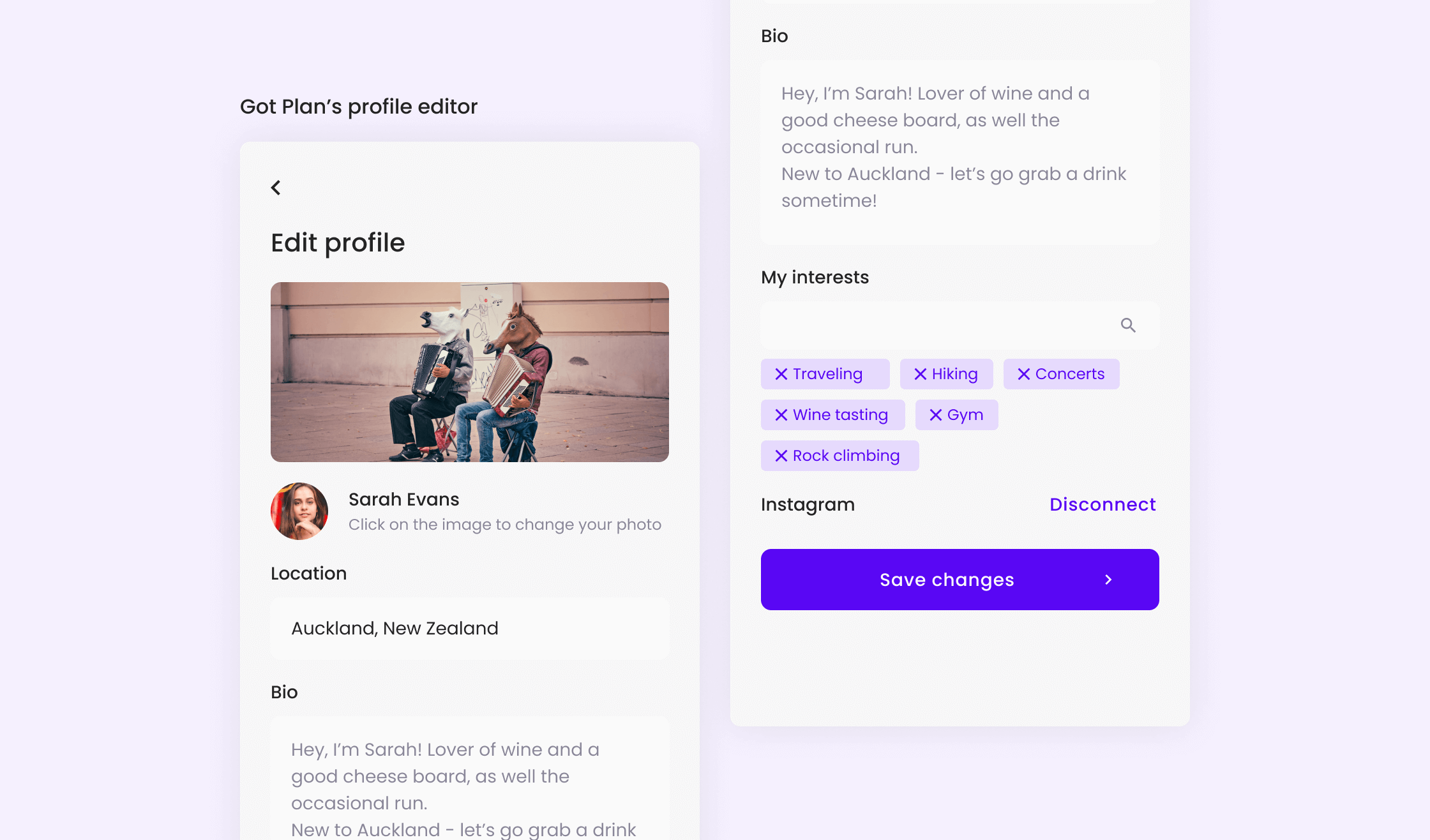
Users can easily set up a profile for themselves, allowing others on the platform a chance to get to know them, their interests and find other plans they might've created. Users can also link their Instagram account to their profile, providing more insight into what they're like (it also helps others know they're a real human!)
It's easy for users to stay in the know with the notifications and favourites tabs. While notifications shows them who's interested in their plans, the favourites tabs allow them to get an 'at a glance' view of all the plans they're currently interested in on site.

The branding and site design was well received by users when the platform launched, with a number of users signing up, hosting plans and connecting with others. Local businesses were also onboarded, allowing users to browse the experiences these businesses have to offer as well.