1 UX/UI designer, 1 product manager, 1 CRO manager
UX/UI design, design system, interaction design
Figma, Google Optimise, UsabilityHub
As part of our strategy to grow our listings audience and increase engagement across listings on our site, we were tasked with redesigning our listings page to improve the user journey and help users find the information they’re looking for with ease. The page was also in need of a visual design refresh to match our redesigned homepage and new style guide, with changes from the listings redesign then flowing into and influencing the design of our estimates and suburbs pages as well.
With a clear brief from the business, we set out to redesign our listings page based on data, user research and testing. We made sweeping changes to the layout and order of the page, as well as completely revamping the visual look and feel of it (with changes also flowing into the design of our estimates and suburbs pages), making it more user friendly and simple to use.

The existing listings page contained a great deal of information, however was incredibly long, illogically laid out and ordered; making it hard to navigate and find relevant information. Collected data showed that most of our users weren’t scrolling to the bottom of our listings pages, and were leaving prematurely without finding what they were after. An Omnibus survey taken in September of 2020 concluded in us finding that only 4% of users found OneRoof “easy” to use compared to our competitors. The survey also asked users to rank the importance of information found on our listings page, to better determine whats most important to them.
Based on the collected data we identified the five key pieces of information property hunters are after are:

With a better idea of what information users were looking for, we decided to reorder our listings and estimates details pages via A/B tests to see if this would have an immediate impact on user behaviour.
With all versions of the page, we kept the agent supplied informations regarding the listings (as well as the agent contact details) at the very top of the page, only making changes to the content that followed after it (and is essentially supplied by us). Our OneRoof property estimate, the property’s RV, history and council data, were all moved further up the page, with our ‘About the area’ map moving from the top to around the bottom area as users weren’t as interested in this information.

The reorder had an immediate impact on our estimates page, with registrations on page increasing by 17.4% (concluding that reordering the page was having a positive impact on users registering through our estimates gate). However on our listings page, the reorder had no direct impact on user behaviour. Based on these results, we decided to implement the changes made by the reorder and move onto the next phase of our redesign - grouping content.
We took the reorder a step further by then deciding to group ‘like content’ to allow users to find content quicker instead of having to continuously scroll down the length of the page. Our groupings were based on content that was related and connected to one another, some examples include:

Once the grouping was sorted, the next step was to fully redesign the page considering the new order and groupings. We decided to go with a tabbed approach for the groupings, thus allowing the page to hold the same amount of content yet be shorter in length and easier to navigate (Also allowing us to track tab clicks to see if users were engaging with the tabs and finding the content they were looking for).
Visually, we wanted to make the page feel cleaner, simpler and fresh, thus we went for a look and feel that really focused on the use of good spacing, margins as well as white space.


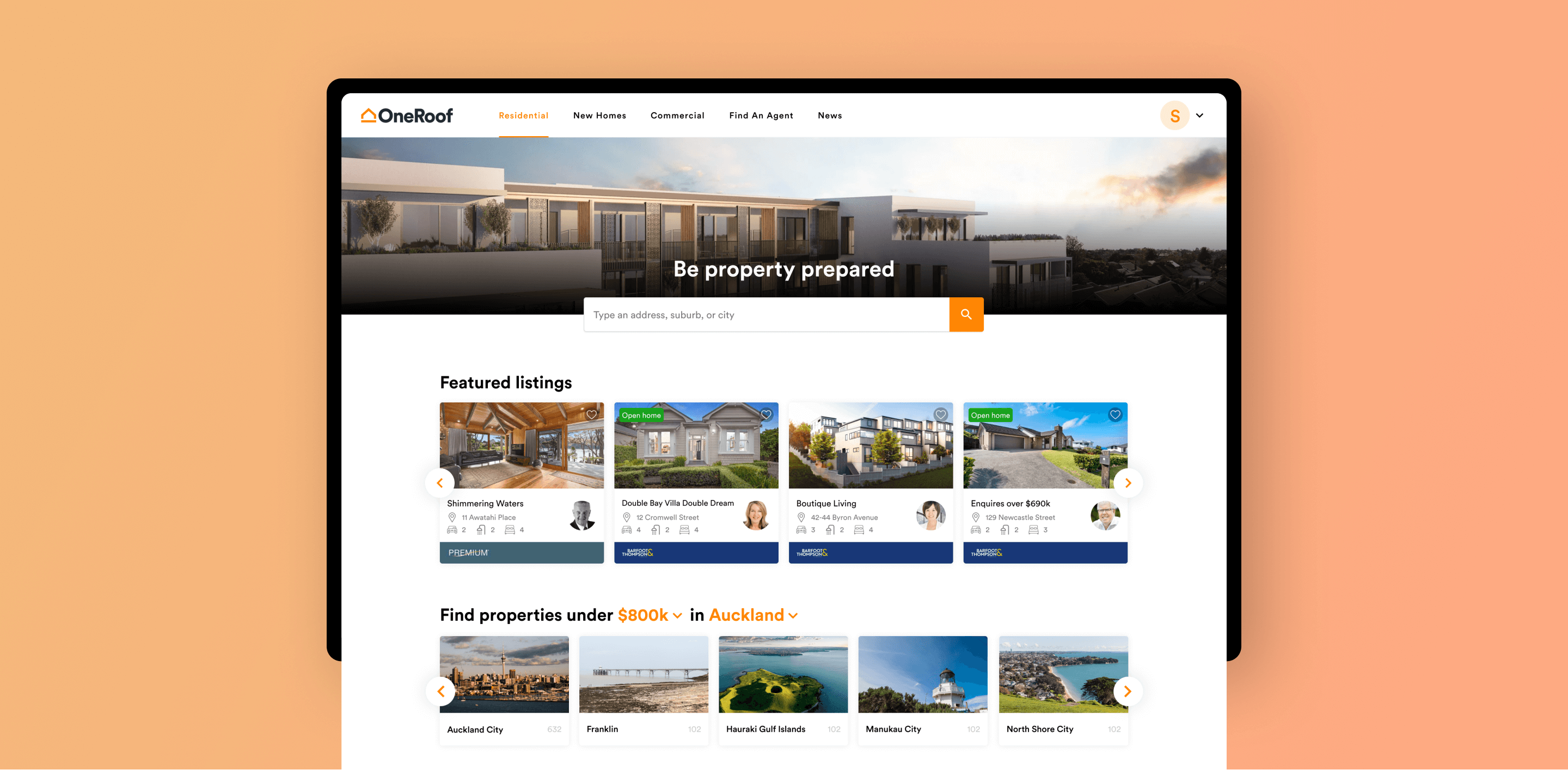
The page was redesigned to have the images be the first thing a user sees once they land on the page. We decided to highlight the first listings image to really showcase it to users (as the 1:3 ratio split previously gave quite a cropped view of the property). We also decided to better highlight the media options available on a listing by making them more visible and prominent, and displaying them on top of the imagery themselves (e.g. properties which have floor plans or videos tours available will have the relevant icons display in their media section)
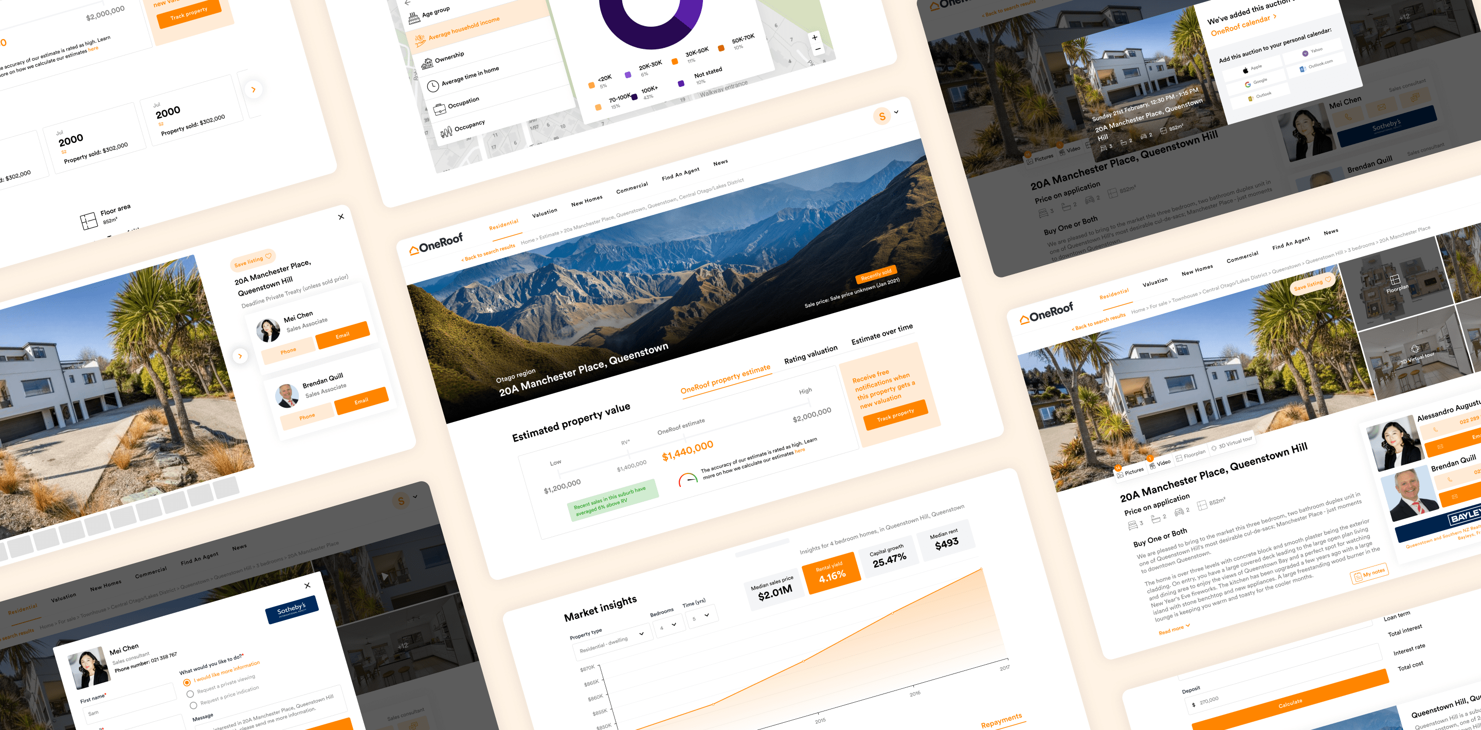
For our estimates and suburbs pages, the image section is really the only section that differs from the listings page. We decided to move away from the map view we previously had displayed here (as we had 3 maps on the page) and brought in region specific imagery to display here instead for a more visually appealing look.

A two column approach was taken to display this information, with the listings related write up and information to the left and agent contact details (as well as open home and auction times) to the right.
The agent cards were redesigned to have the CTA’s appear in a uniform fashion to the right of the agent photo, as well as also display using OneRoof brand colours opposed to each agency’s unique branding (there were colour related accessibility issues with this as some brand colours didn't have enough contrast for text, CTAs etc.)
The open home and auction time cards were changed to now appear in a more list like fashion. This is particularly useful when a listing has a number of open home times (the list can be condensed and takes up less space compared to individual cards for each time)
As per the results from our Omnibus survey, we decided to move our OneRoof property estimate to the top (the first item that displays under the OneRoof data line), and group it with our RV information by utilising tabs. A CTA was also added to encourage users to ‘track properties’ (a function thats quite relevant for estimates, giving users the opportunity to know when a property hits the market or gets updated estimate information).

We also decided to create a new piece of information using what we currently had called ‘Estimate over time’. As the name implies, the graph would show how a property’s estimate had changed over a period of time (on a monthly basis), allowing users to quickly notice trends as well as dips and peaks with the estimate. RV and suburb related information were also added to show how things were tracking for a property, as well as how the suburb it was in, was doing.

Extra details about the property (property history and council history) were displayed next, one after the other. The property history timeline was redesigned to display as cards in a horizontal fashion, thus saving space on the page as it wouldn’t push content down further when expanded. The cards were also able to contain agency branding (say if an agent had claimed a previous sale of the property) and agent photos.
Council data was also overhauled to appear in a more engaging, digestable way. The previous two column list style was easy to glaze over and miss as the content displayed in a heavy, block like way. The redesign cleaned this up by adding in icons to represent each piece of data, as well as varying font sizes and weights to distinguish between labels and data pieces. The section was also reordered based on what was most important to users when looking for a property, with the four most important pieces of information (land area, floor area, unitary plan and type of title) always being visible, and the rest only being displayed when the user clicks ‘View all’.


More general, suburb related information was displayed at this point to give users a greather understanding of the area. Our ‘About the area’ map was the main map left on our page (as we axed our recently sold section and integrated that information into the area map) and went through a complete overhaul. New map layer data was added (unitary plan, underground services, contours and flood assessment) to further inform our users, and the visuals were updated across map sections to better display information and data.
The market insights graph and suburbs blurbs were also touched up to suit the overall changes that were being made to the page.


Finally, our mortgage calculator was redesigned to work and read better. The calculator now displays in a two column layout with the input fields on the left, and the display fields (some with toggles) on the right, allowing users to quickly see calculated results without having to manually enter in mortgage rates and terms (the rates are now updated and fed in, meaning users can quickly see what their repayments will be like given the current climate)

The redesigns left us with a visually cleaner and intuitive experience across the listings and estimates pages. The content and detail contained on the pages stayed the same, with the length of the page reducing by around 30% across both mobile and desktop.
The redesigns have resulted in lifted user engagement on both the listings and estimates details pages. We’ve seen a 46% increase in call agent conversion rates, an 8% increase in user’s saving properties, a 6% increase in users registering on our estimates gate and an 11% increase in users completing a profile post estimates gate. We’ve also seen the average session duration go up by 6.9% and the bounce rate drop by 42.8%.