1 UX/UI designer, 1 product manager, 1 CRO manager
UX/UI design, design system, interaction design
Figma, UsabilityHub
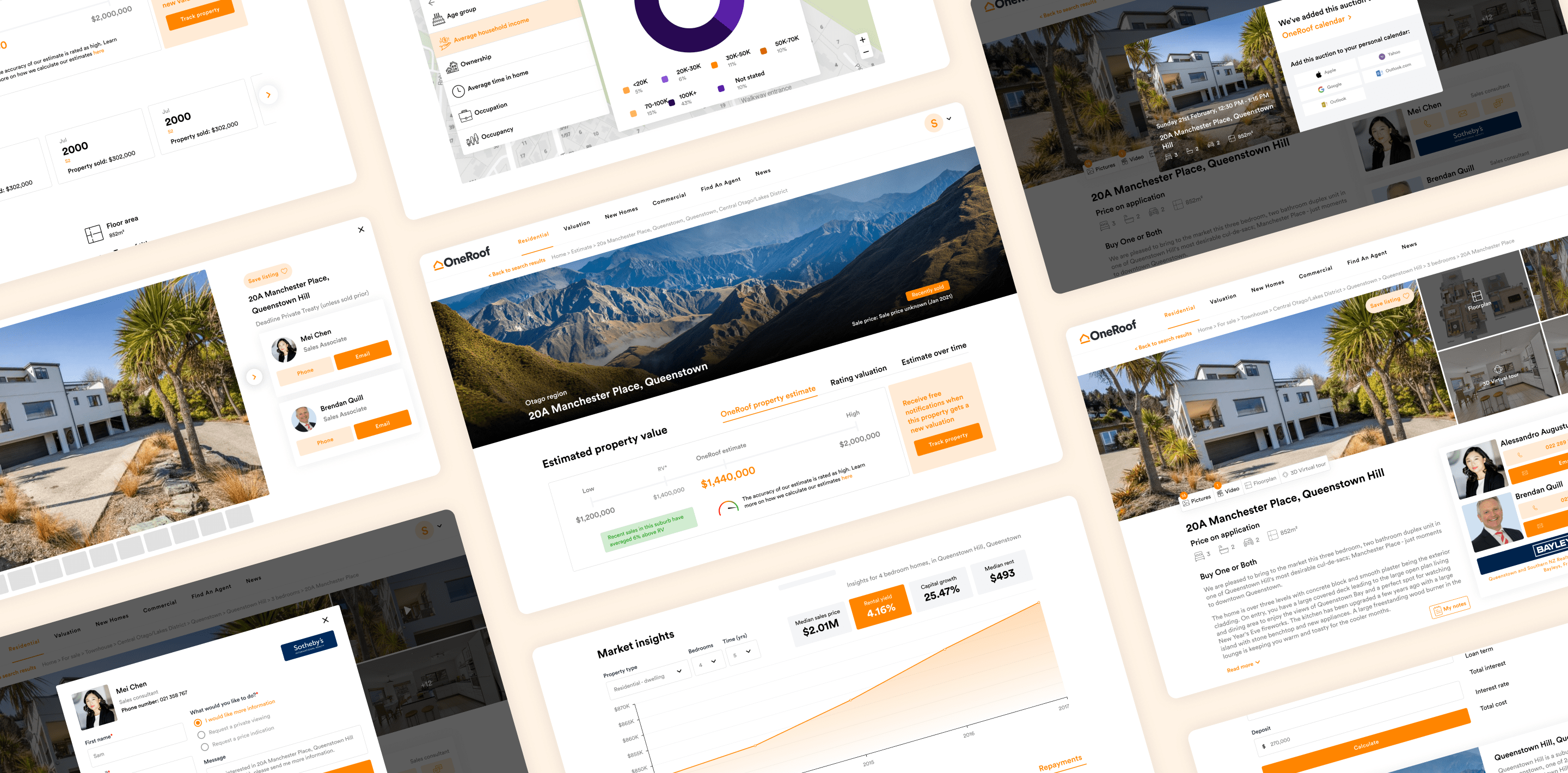
We (OneRoof) knew there were some hurdles on our site making it difficult for users to find what they were looking for. From the multitude of search options offered on our homepage (as well as our main search journey itself) users were confronted with a range of options making it difficult to make decisions efficiently. There was no easy way for users to jump back into previous sessions with us, and the experience across app and web was inconsistent. The site was also in need of a visual refresh to enhance user experience, increase engagement and tidy up general elements on site.
With these issues identified, we decided to redesign our website based on data, and with our users at the core of our decisions. We made bold changes to our search journey, navigation and visual interface resulting in a cleaner, updated UI and a standardised user experience across web and app. We also introduced new sections to drive engagement and help users dive back into their previous activity.

To kick off our redesign, we conducted a preference test to determine what style of homepage our users preferred - single or multi. The single version focused on having one homepage where a user would use dropdowns to define their search across a number of categories (For sale, for rent, sold properties, estimates as well as our search options under our 'New homes' and 'Commercial' groupings). The multi page version stayed true to our existing navigation where each key section had its own landing page as well as search box. Here, instead of hiding categories would be displayed at the top of the screen so that users can easily find them.

The feedback we received showed us that people found the multi homepage approach simpler to use and more user friendly. The overall consensus was to combine the two approaches to form a hybrid.
The hybrid approach allowed us to rethink the way we group content. Previously, we didn't explicitly group our residential offerings together. Because of this, every form of residential related search we had on site (whether it be to find houses for sale, find estimates, find sold properties or even find suburbs) had its own duplicate landing page with it's own search box.
Our new, hybrid homepage came with an improved navigation structure, allowing users to navigate through some of our key sections on-site. This approach also highlighted an opportunity to further simplify our search journey, making us wonder if a user selecting a location first could work better than a user selecting a search type and a location at the same time.

We performed a competitor analysis to see how other players in the industry, both local and global, had defined their search journey. 67% of businesses in this space had opted for a location first approach, with 33% opting for a search type first approach.
We then conducted another preference test, showing our users our two different search approaches. The first focused on a location first search, with the search type only displaying on the second screen once users were deeper within the search. The second focused on having both search type and location present on the first screen.

79% of our participants preferred a location first search, with 23% of these users stating that location was more relevant than type, 23% stating this option was more visually appealing to them and 18% stating that this option was the easiest way to make a search.
Another key area we wanted to address was personalisation, with the goal being to drive users back into their previous activity with us. We identified that we essentially had three types of users: A new user, a logged in user and a returning user (a non-logged user who's used our platform before).
For both the logged in and returning user, we could show them their recent activity and then for the logged in user, we could even surface their saved searches & listings, allowing them to quickly view properties that previously peaked their interest.
We surveyed our users, showing them a version of our homepage which included the kind of personalised content a logged in user would likely see.

Users liked the added sections and had some valuable feedback around them. From adding in icons to match the look and feel of our search screen, to rearranging the content to show a logged in user their saved listings & searches before their recent activity (as this was more relevant to them). Users also suggested adding drop downs to condense sections when they weren't needed.
The new homepage designs have seen an increase in user performance across the site. Users moving from homepage to listings is up 13%, from homepage to news is up 33% and from homepage to the login modal is up 31%.
Our results show our users are also more engaged with users who visited the homepage also visiting a listings page up 21%, and listings views per user (for users who viewed the homepage) up 18%. The average time spent on the homepage has gone up on both desktop (by 15%) and mobile (by 21%) with the average session duration increasing by 8% on both platforms.


The final, approved designs include the changes outlined above, as well as further changes to the nav (regarding user profile), changes to the hero image and search bar look and feel, desktop designs, our breadth of search journeys (from searching via address or suburb, or searching via multiple suburbs either by typing or using our list) as well as the changes to the other landing pages on site for our Commercial, New homes and find an agent sections.
Our navigation utilises our updated look and feel across the platforms and completely removes the hamburger menu on mobile, leaving nothing hidden from view.

Views showing what each of our user types (new, logged in and returning) are likely to see upon landing on the homepage.

Whether you want to type in your search or select a location from a list, we've got journeys to support both kinds of users. Search by address, suburb or city (or even multiple suburbs if you want).

Once the look and feel for residential was agreed upon, we went about updating other key sections of our site to ensure our look and feel was consistent across commercial, new homes and our find an agent section.